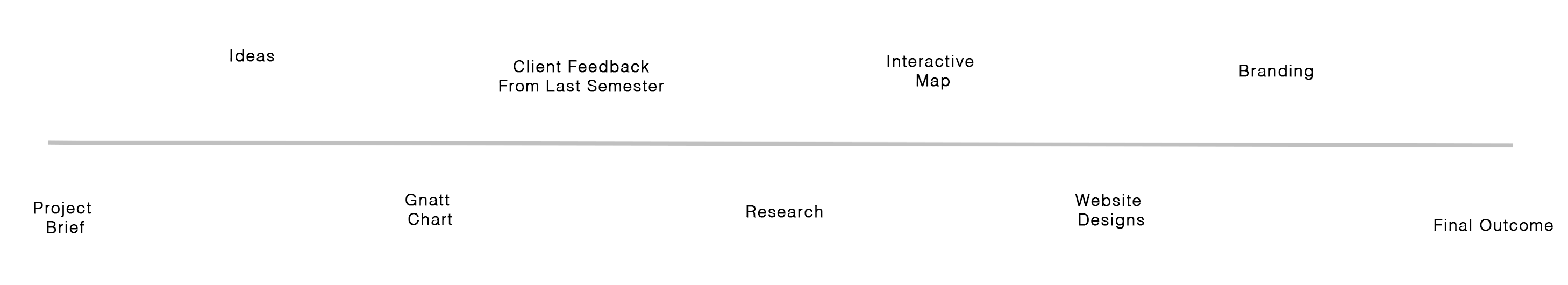


Our task was to work as a group to design and create a new and improved website for West Hill Cemetery. Continued from semester 1.
Project Brief
You will be working on a client based project in which you need to find an element within your chosen area of specialisation or one which you wish to enhance / explore. You may choose to be teamed with other designers according to the elements in which you wish to specialise, or a developer. Discussions with the developer will be ongoing so that the design is built to a complete working product or prototype depending on the client’s requirements.
Below is a proposal we sent to the client last semester about the project and what we can do for them.
Initial Ideas
I brainstormed ideas to start the project and gather thoughts and aspects that may go towards the project. Eventhough we all have our specfic jobs (mine is being in charge of the intercative map), we all created designs for the branding and website for West Hill Cemetery.
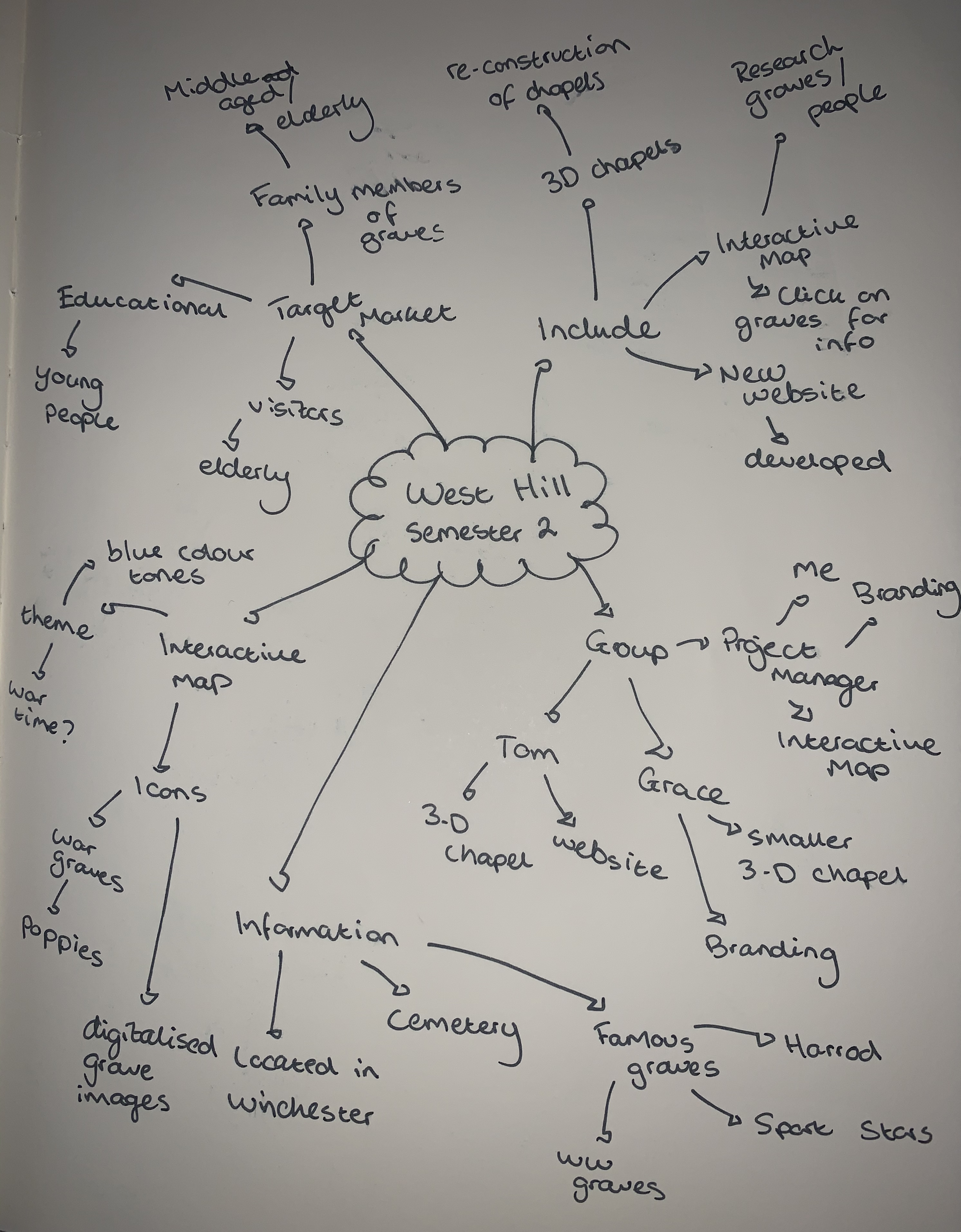
West Hill Cemetery is located across from the university reception and forms a popular route through to the city centre. The cemetery holds a vast amount of history and contains important individuals who were once buried here, including many soldiers from World War 1. Therefore, it is our duty as designers to successfully promote the Cemetery to educate the public about the history that lies within West Hill Cemetery. The first stage of this project has already been completed by which was to get a web presence created by using Word Press in order that the client can make their own updates. The second phase requires more depth of content.
Our Objectives for the project this semester include:
Complete the website for the West Hill Cemetery by finishing the look and feel of the website through design
The VR views of the Chapels that once stood in the middle of the cemetery need to be complete and added to the website
The interactive map showing the position of all known graves needs to be included within the website
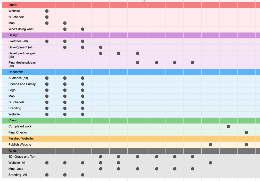
Time Mangement
I created a Gnatt Chart to keep on track with my studies and projects this semester and have good time management. I always ensure I have enough time towards the end of the semester to make appropriate changes and submit my work.
As this was a group project, it was important to ensure we met regularly to share ideas. As I was project manager, I wanted my team to be working equally so we can combine all of what we developed together. I held alot of responsibility being in charge of my group, so I wanted to set goals and times to complete each element by. Below is my individual Gnatt Chart.
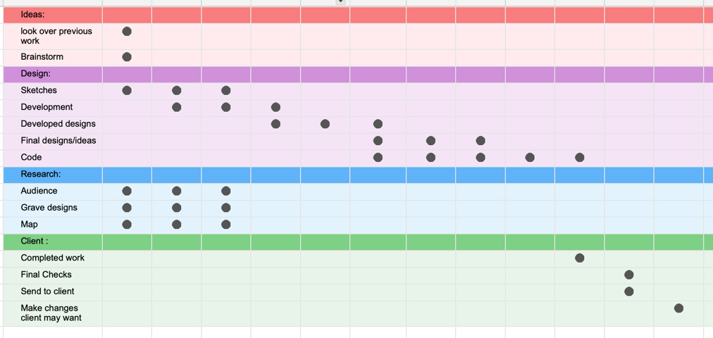
Below is a Gnatt Chart I created for my whole group.
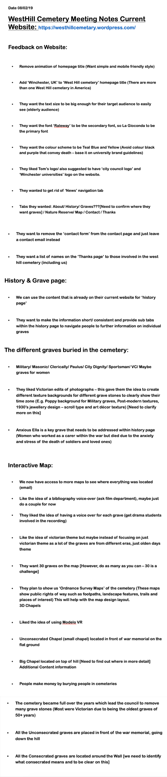
Previous Client Feedback
We did not want to make the same mistakes as last semester and therefore we wanted the client to be completely satisfied with what we produce this semster.
Research
It’s important to research into designs to get inspriation and ideas.
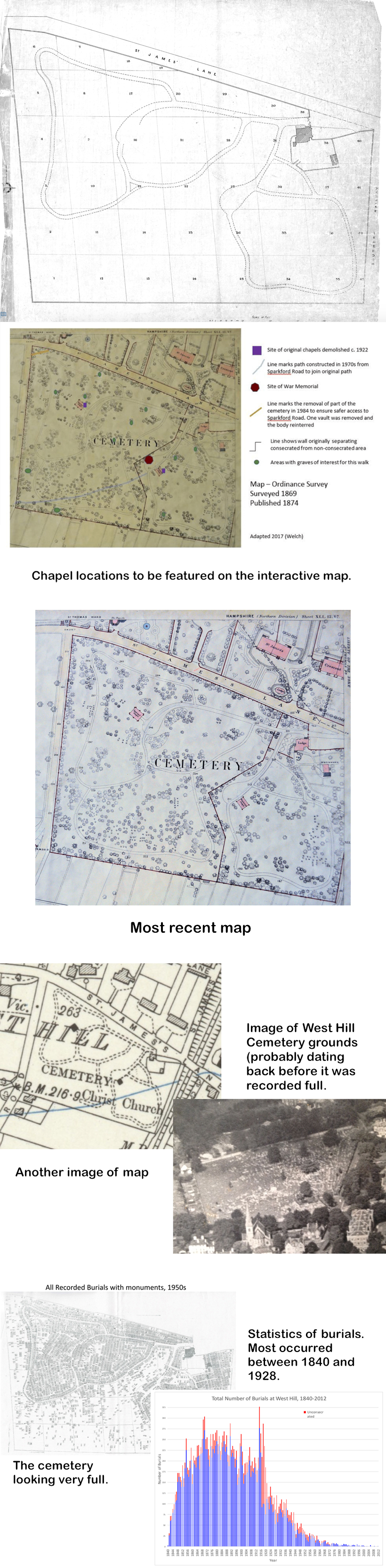
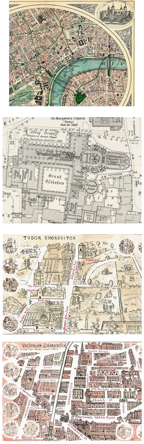
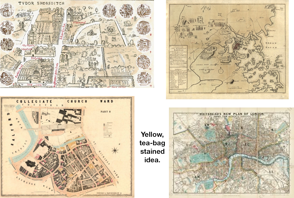
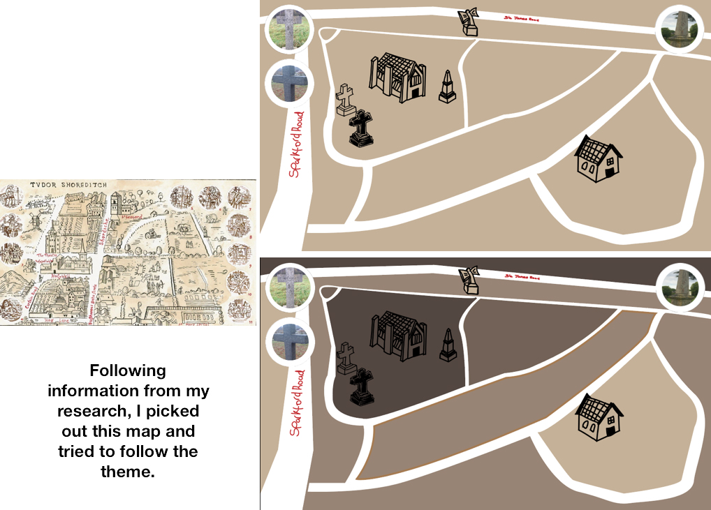
We got sent information and resources from the client. Below are the map designs and some further information towards the map which should benefit me when improving my map designs.
I was also sent images which can be added to each grave to show the users what the graves used to look like aswell as the updated images.
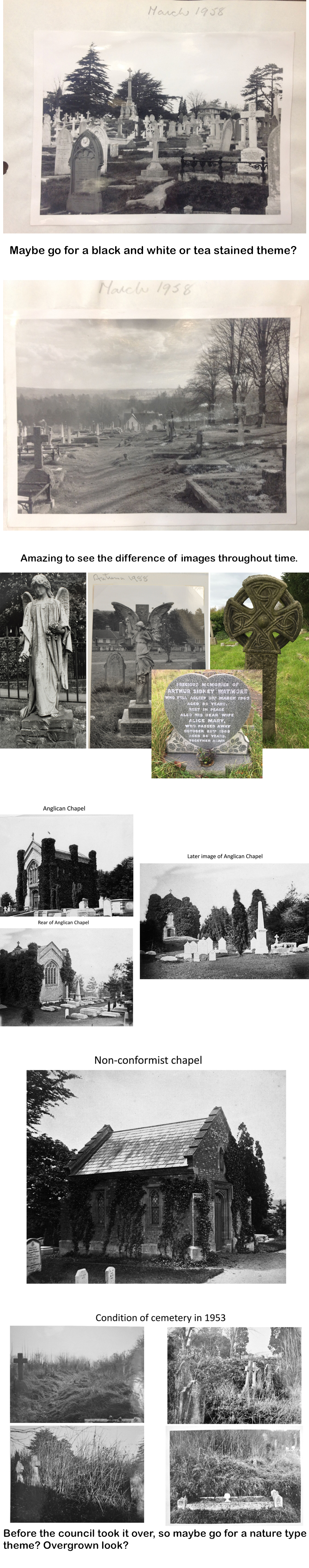
I wanted to look into different themes and felt World War 1 would be appropirate due to many of the graves from this event. However, in the end I decided to go for a victorian style theme as felt this worked with the project being a cemetery.
I also went to the cemetery and photographed their map at the entrance to use as inspiration and would keep in with the cemeteries theme:
I also thought of following the design of the Universities map.
However, after more research after feedback of my designs being too basic and bold, I picked out some more victorian and war time looking maps that the clients liked the look of.
Interactive Map
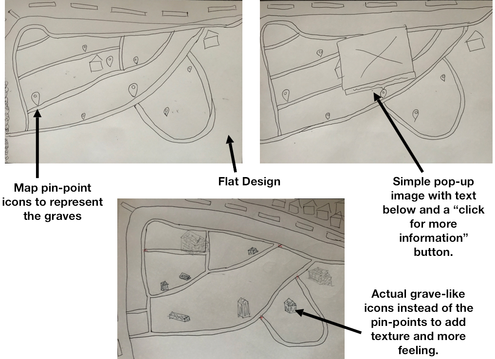
As I was in charge of the interactive map, I put most of my efforts into this element of the project. I thought of various ways to improve the map I completed last semester.
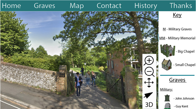
Below are my sketched designs from last semester.
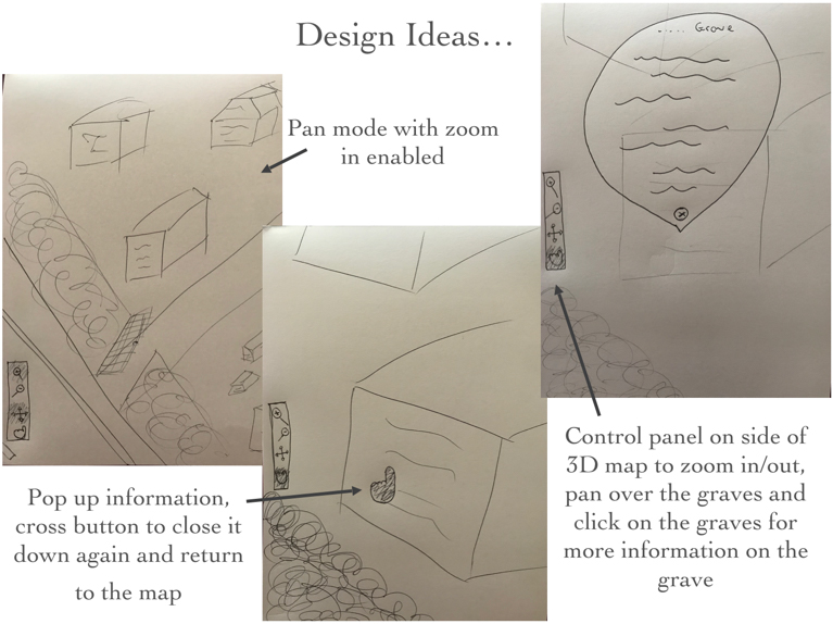
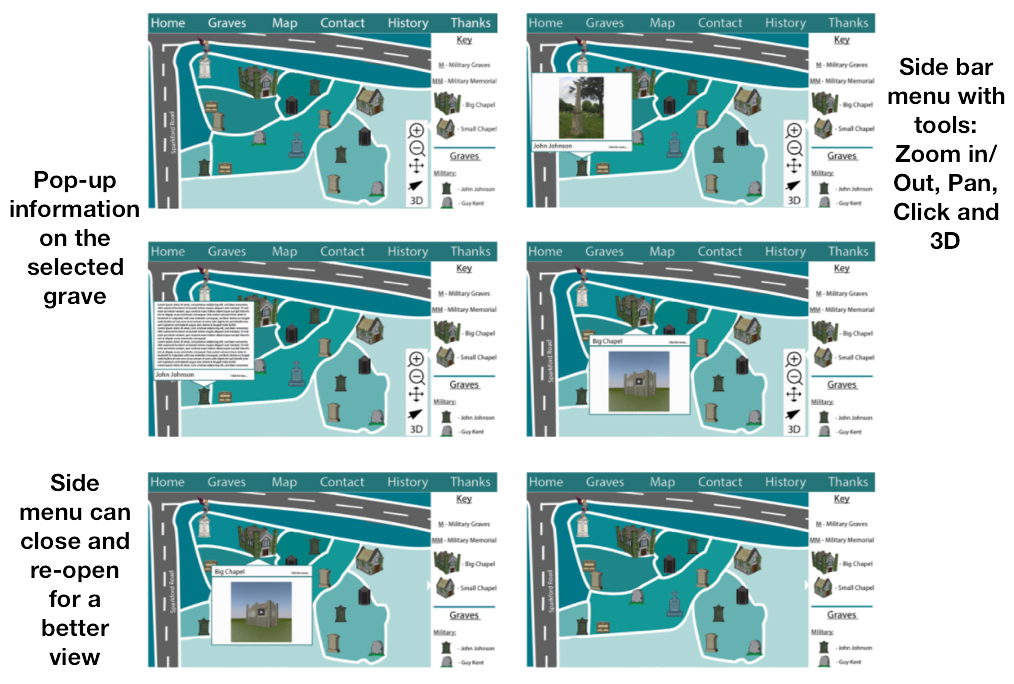
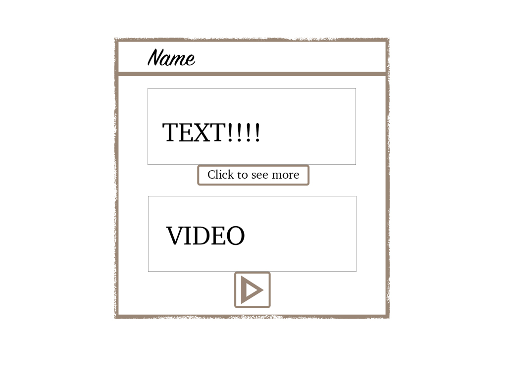
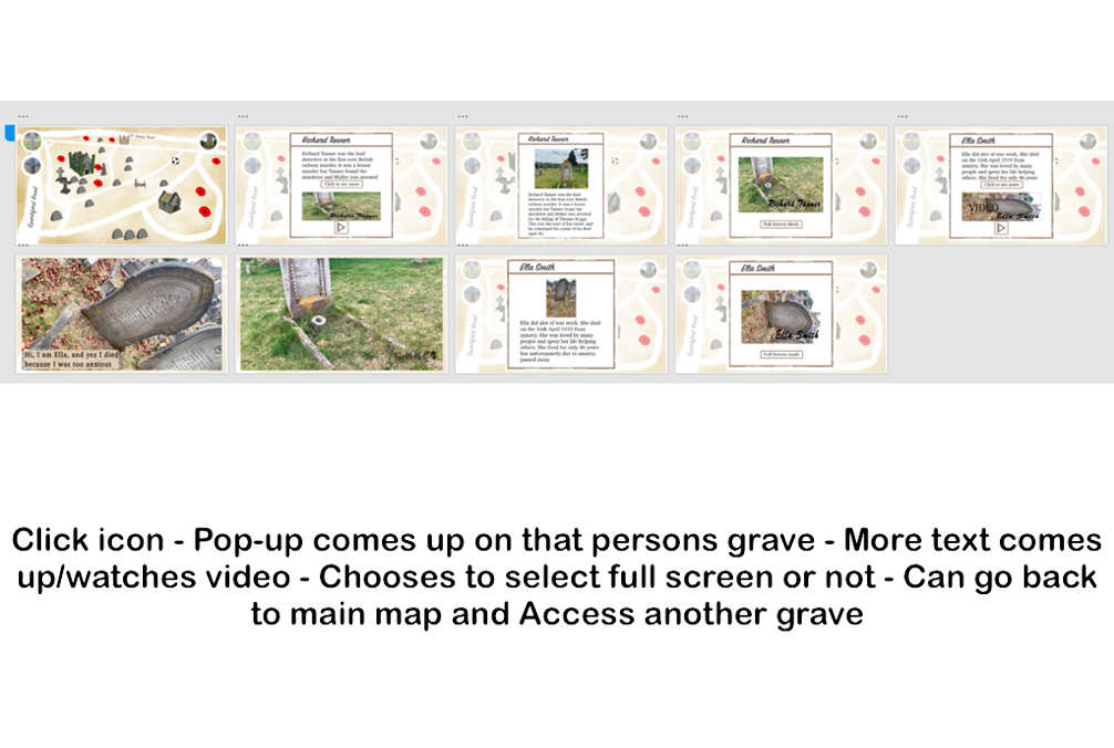
The design below turned out to be my favourite design which I then developed further digitally. I liked the 3D graves and chapels on the flat design map, as felt it brought a more realistic feel to the map and the users can clearly interact with the different graves and find out more information on them with the pop up feature. The users can also get too specific graves with the list on the right hand side. I will need to add a key and tool bar to the map in my final design. The design will take up the whole screen when the user visits the website so I’ve tried to portray that in these designs to make sure its the biggest the map can be, especially people using smaller screens than a standard laptop etc.
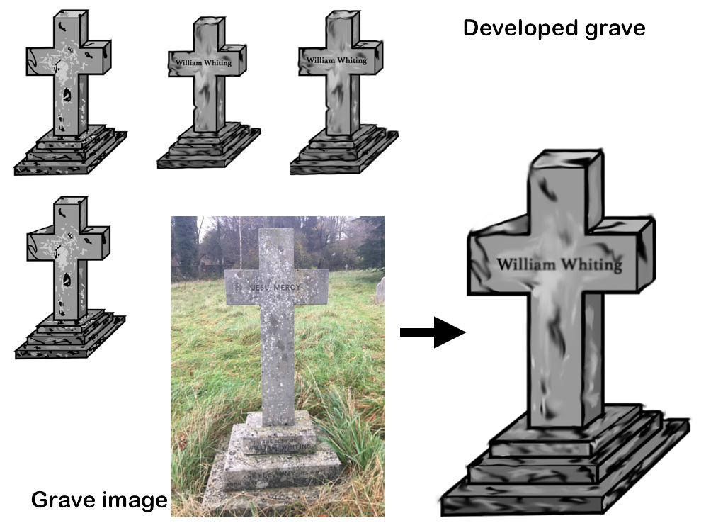
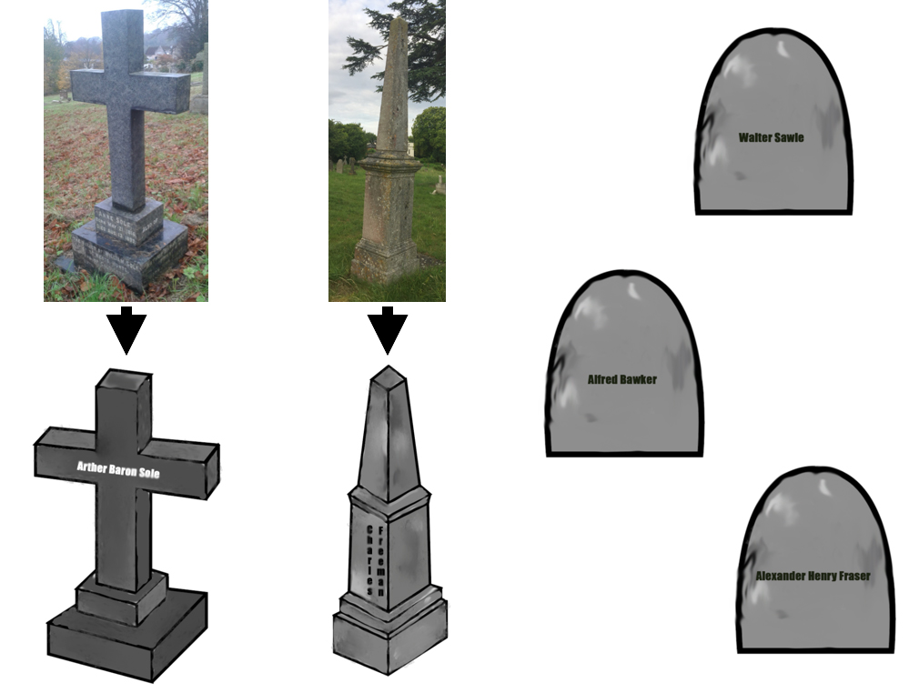
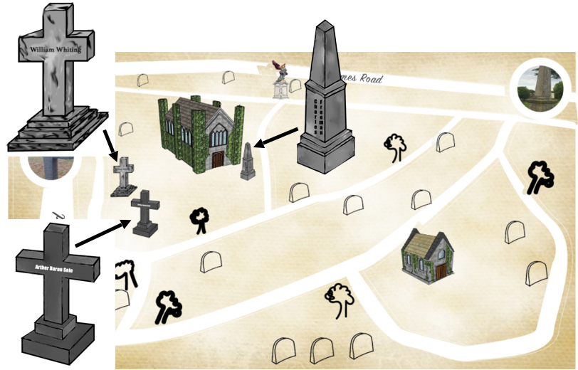
I decided to create 3D icons for the map to add a realistic touch. I got images of the graves and tried to copy what they looked like but in a cartoon/digitalised way to match the theme.
For the grave images I didn’t have access to I thought of just using a simple gravestone with their individual names on.
I then developed my initial sketches digitally from last semester.
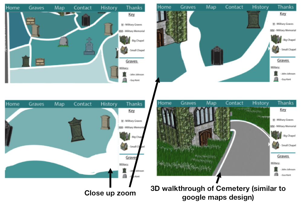
I liked it due to it being clear and simple to use. The 3D element of this map I really liked as would give users the opportunity to walk-through the cemetery if they can’t get out physically to the cemetery (use at home option). The clients liked these designs too, but in this semester I wanted to use more of a theme for the map to fit in with the Cemetery and have more texture and interest about it.
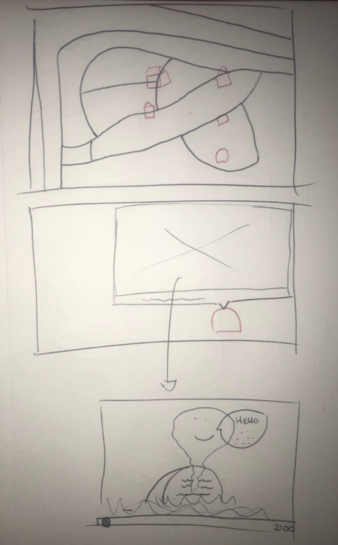
Sketches of ideas. When user clicks on an icon the pop up comes up with an image of the grave, plus information below, plus a listen button. If the listen button is selected then the bibliography comes up along with the video of the grave. As I can still improve this map. I then came up with the idea of keeping the same style of the map but instead of adding the 3D element, adding a video of a voice over of what the text says. This would be useful for the target audience of elderly people as if they can’t see the text or if anyone is blind, then they’d be able to just listen to the information about the grave instead. Below is a sketch of the video idea.
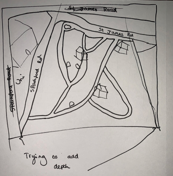
I tried to add depth to the map to make it look more 3D and realistic. Hopefully when I start with digitally designs this will come to life more.
Below is the inital video I created for the map. The information would remain on the screen longer but this was just a demo. However, after getting feedback, I realised this could be seen as not appropriate for the target audience of elderly people and could be seen as insensitive to the subject being talked about. If this was for children it may of worked well as makes it look less scary but still informative.
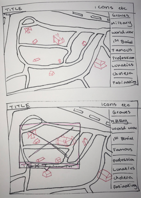
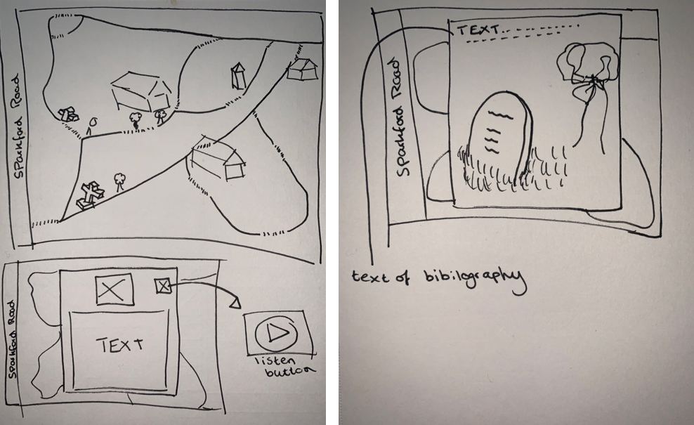
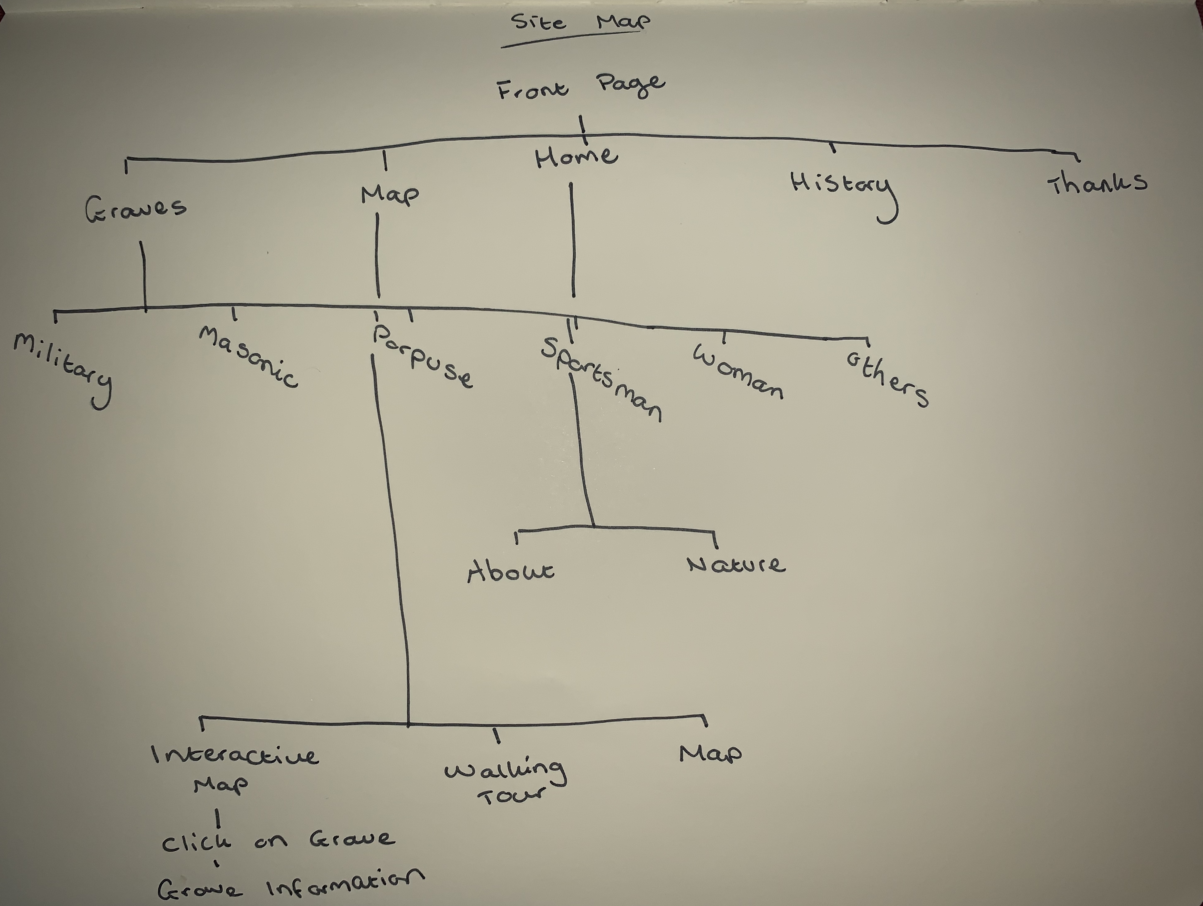
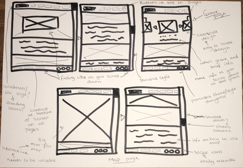
After receiving feedback from my previous map designs, my lecturer suggested using a real image of the grave and background, with the information on the grave to the right hand side. He also suggested using a theme such as war time, or victorian map. Below is a site map of the journey a user may take when using the map.
Original sketched wireframe plans.
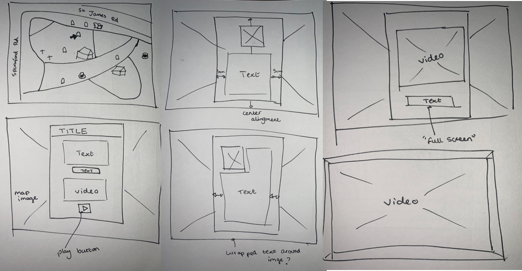
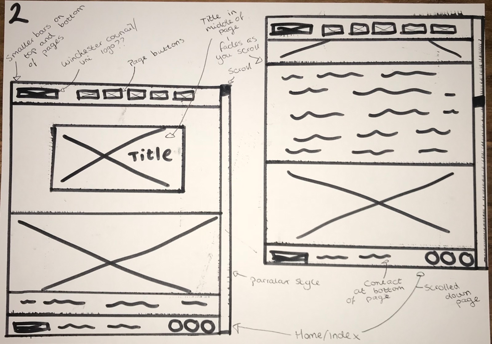
Developed wireframe plans.
I then developed my sketches digitality and following inspiration from my research.
I experimented with different shades of colours, used hand-written text drawn with the paint feature on photoshop, and did the same for the icons. I used photoshop to draw these icons, text etc out because the paintbrush leaves it looking quite smooth around the edges etc. I used Adobe Illustrator for the main path line and background of the map.
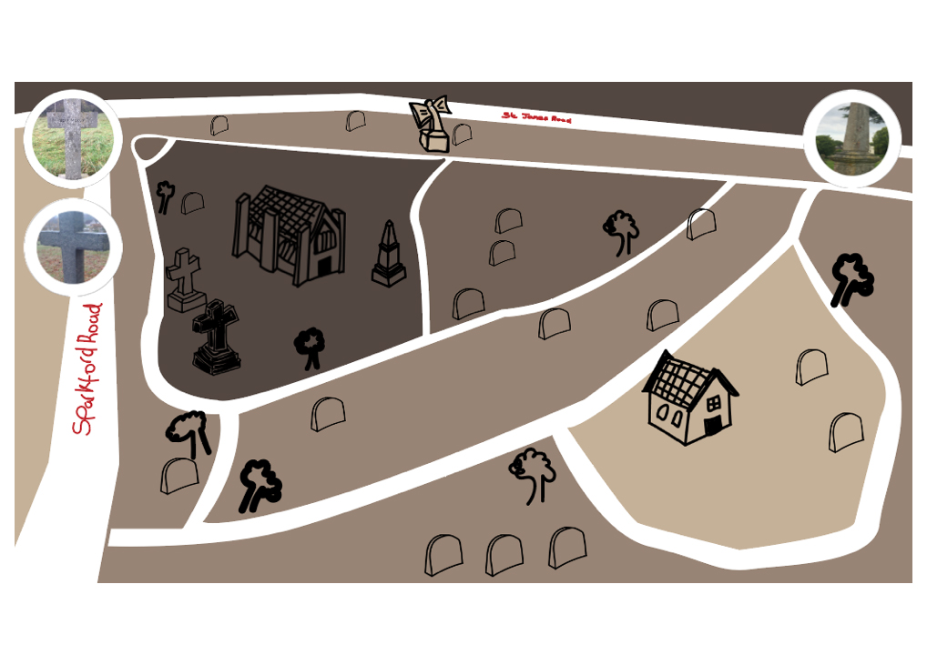
I then took the icons from photoshop and created a new file, again in photoshop, to create this tea-bag background. The font I used for the text is sign painter as felt it looked hand written but more classy and neater than the text I previously drew.
The result was below. I also tried it with and without the path outline but preferred it without the outline as looks more real and blends together well.
I had an idea that the images would be on a rotation so different images of the graves come up every now and then, again to give the map more of a feel and so the users can view maps they may not of clicked on.
I developed the icons on illustrator and then used photoshop to paint the texture onto the graves and added a blur effect.
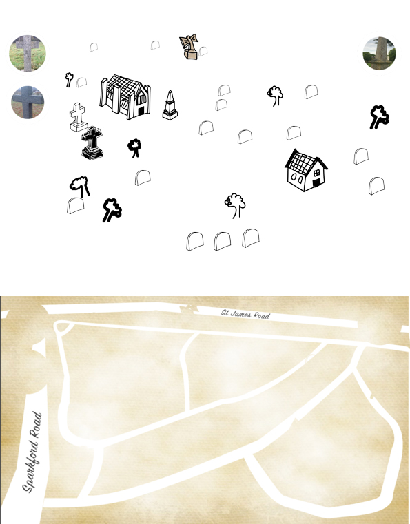
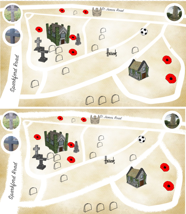
Instead of the hand-drawn icons I decided to go back to my previous map design in first semester and combine the ideas using the 3D realistic icons. I feel the map is now starting to come together and will get feedback from the client in our next meeting.
The clients liked the idea of using poppies to symbolise the war graves. I feel this looks really nice and respectful. I then thought of other icons for the non-war graves so used the “Harrods” logo for Henry Digby Harrod that owned the “Harrods” in Winchester, and then a football for Arnold Tebbutt who founded the football club in 1884.
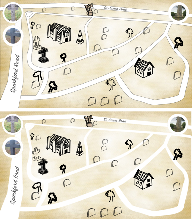
This is my final design so far. I used the paintbrush tool on photoshop with the charcoal effect on it with white paint to go along the outside of the paths. This gives it again, more of an old effect.
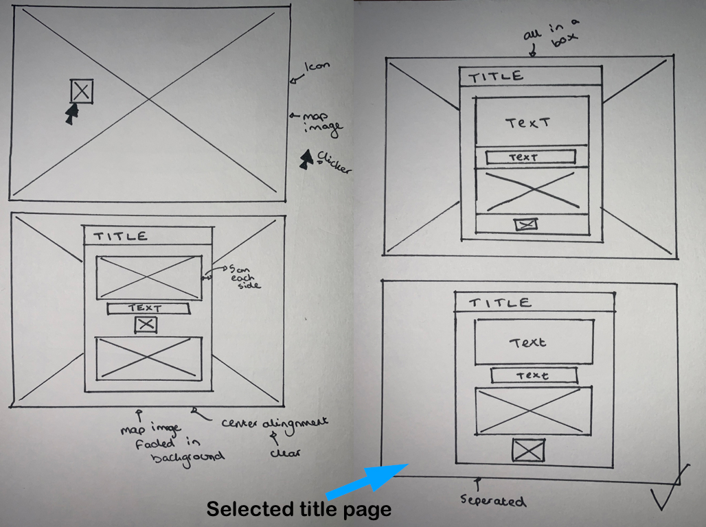
Map pop up designs.
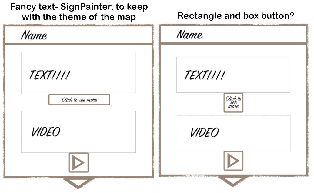
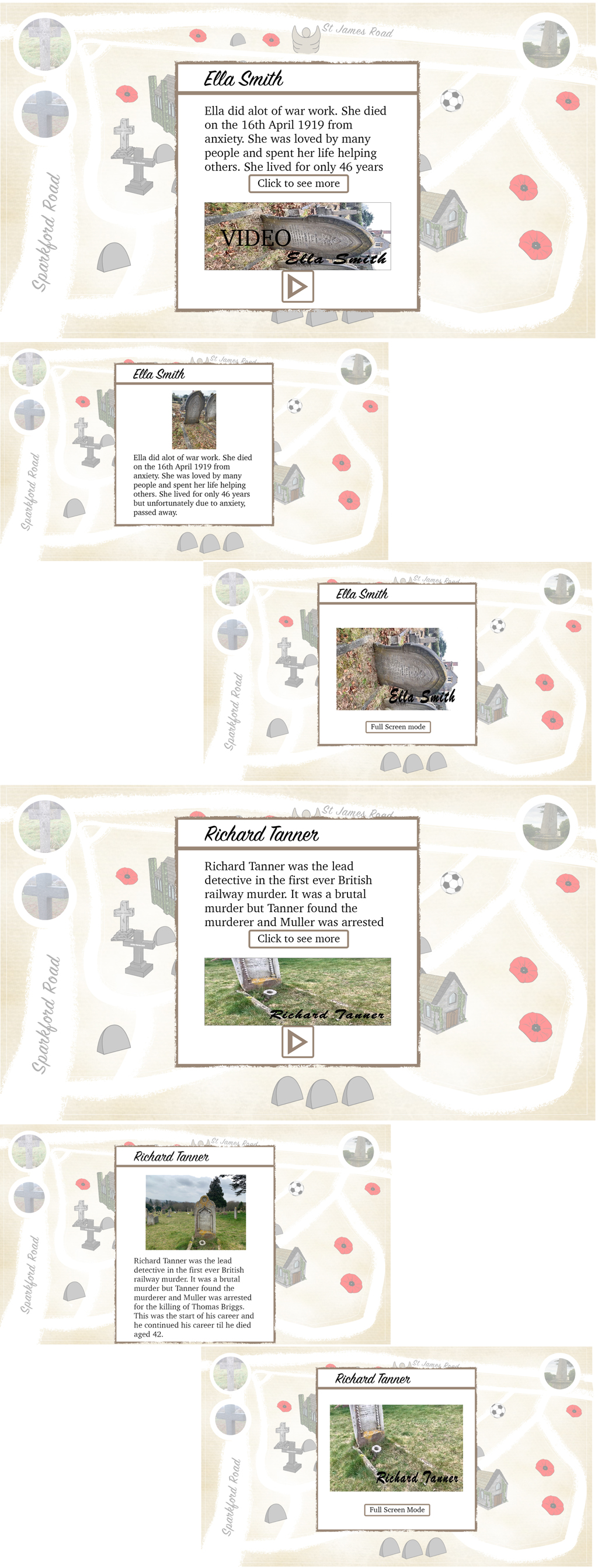
Final pop up design.
Font: Title- SignPainter
Text- Charter
A lot clearer design for the target audience to easily read and understand
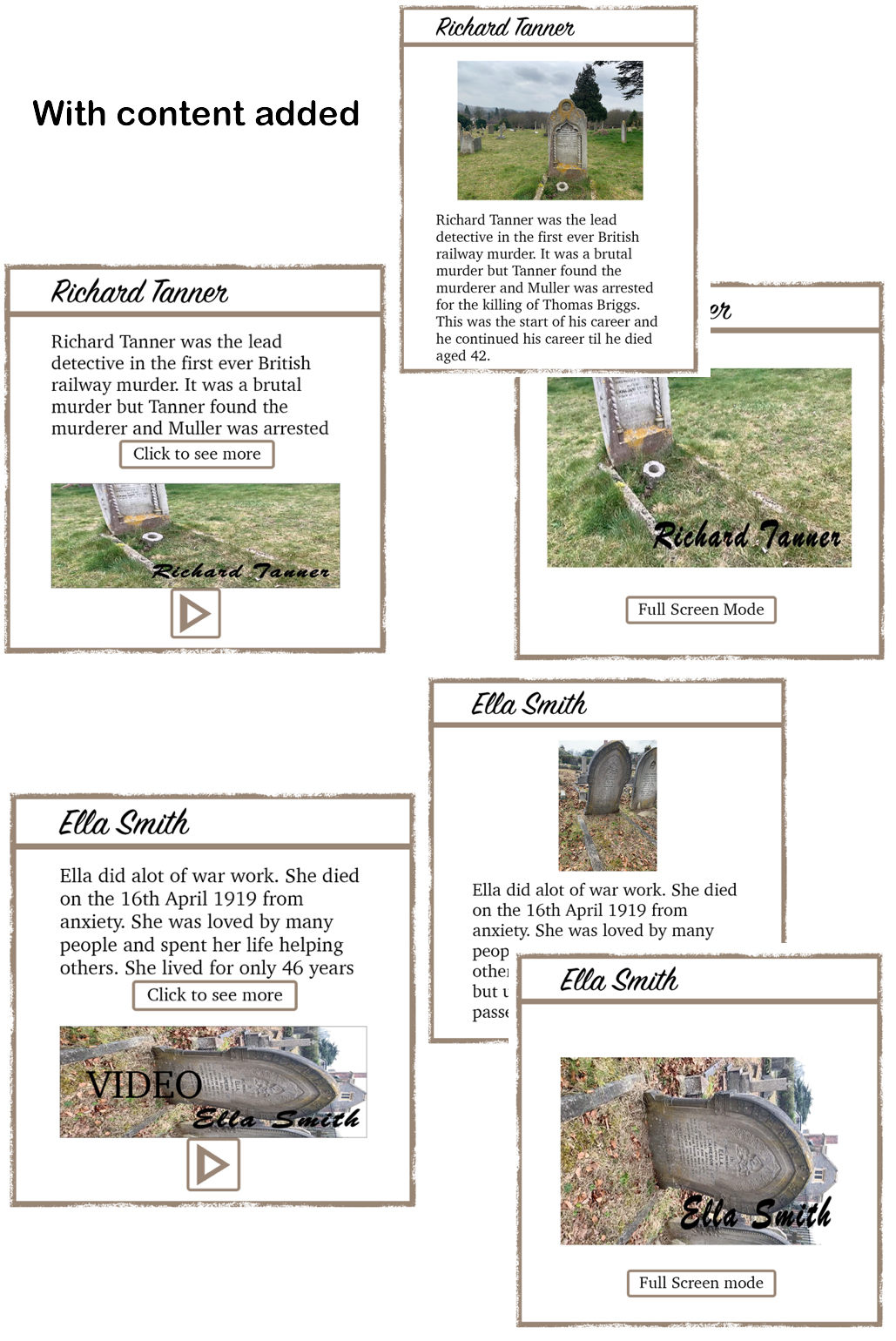
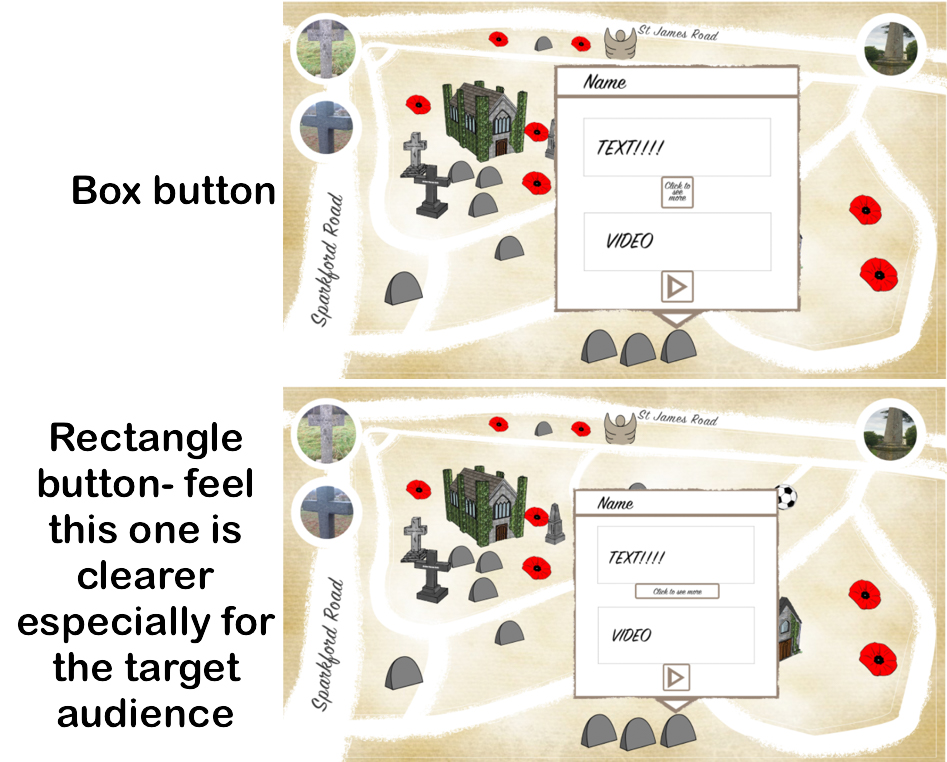
Pop up look on map.
Biblography creation.
Fonts: Title- brush script MT bold (bit bolder than SignPainter and wanted it big for the video title page)
Text- Charter (follows theme of the pop-up and clear to read which is important for the video as the text won’t stay on the screen forever and the elderly demographic watching.
Voice-over: This is to be completed by university film students but I am hoping for a clear but posh voice from the era 1840s (Victorian era) to fit with the theme.
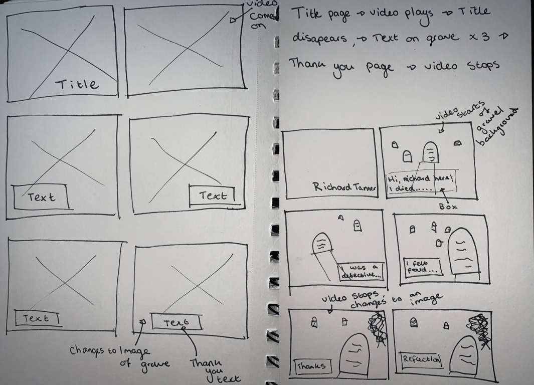
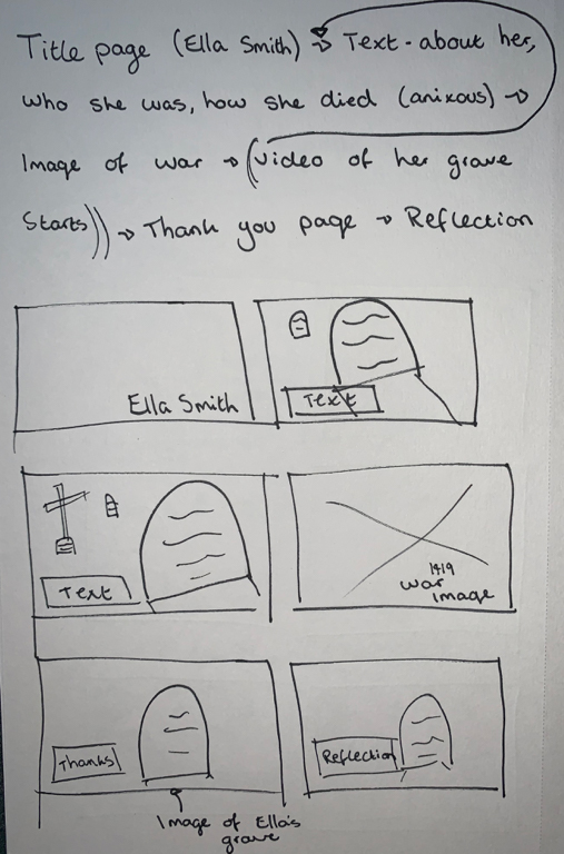
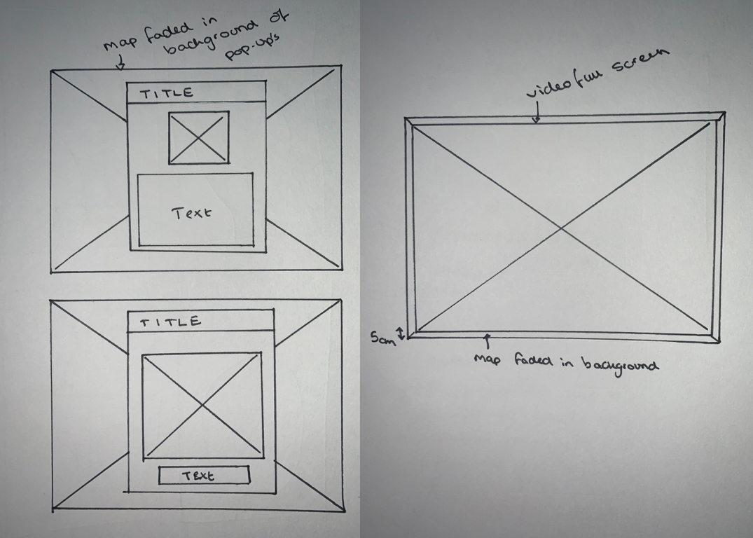
Final storyboard designs.
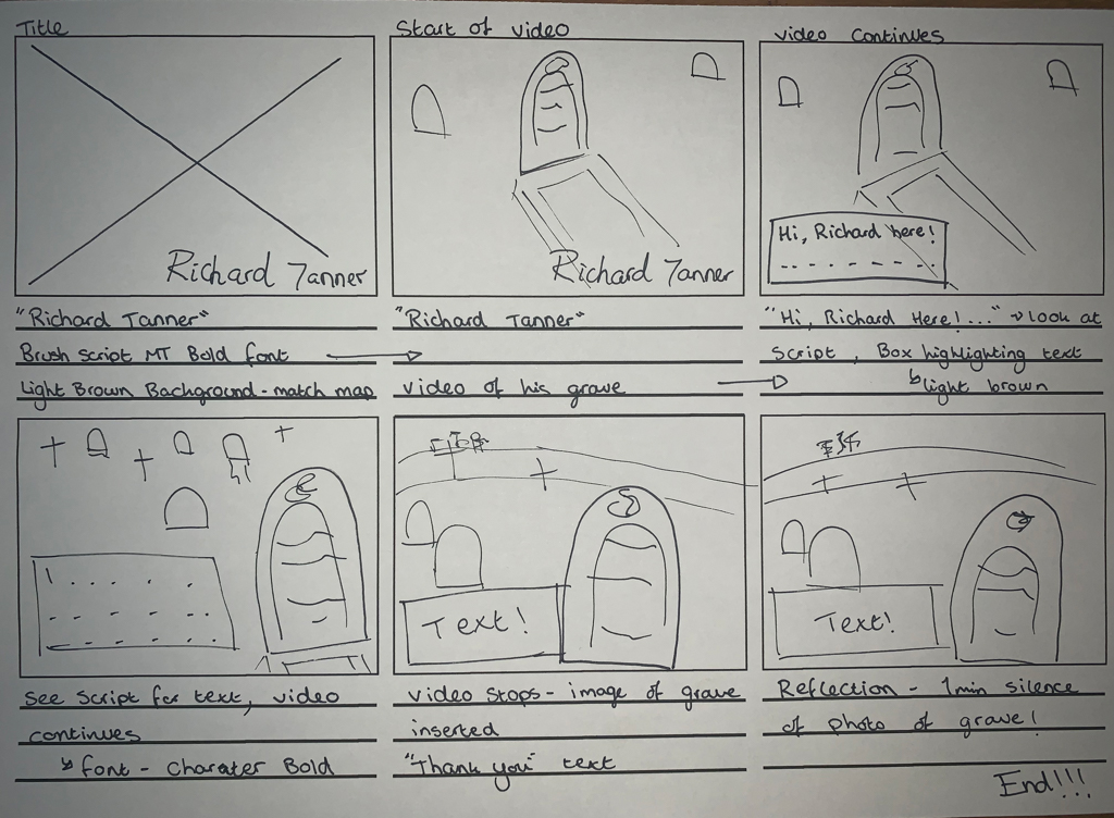
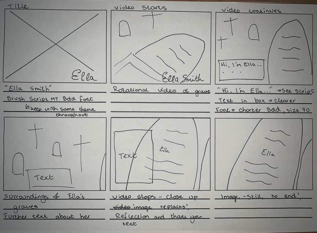
Start of the creation.
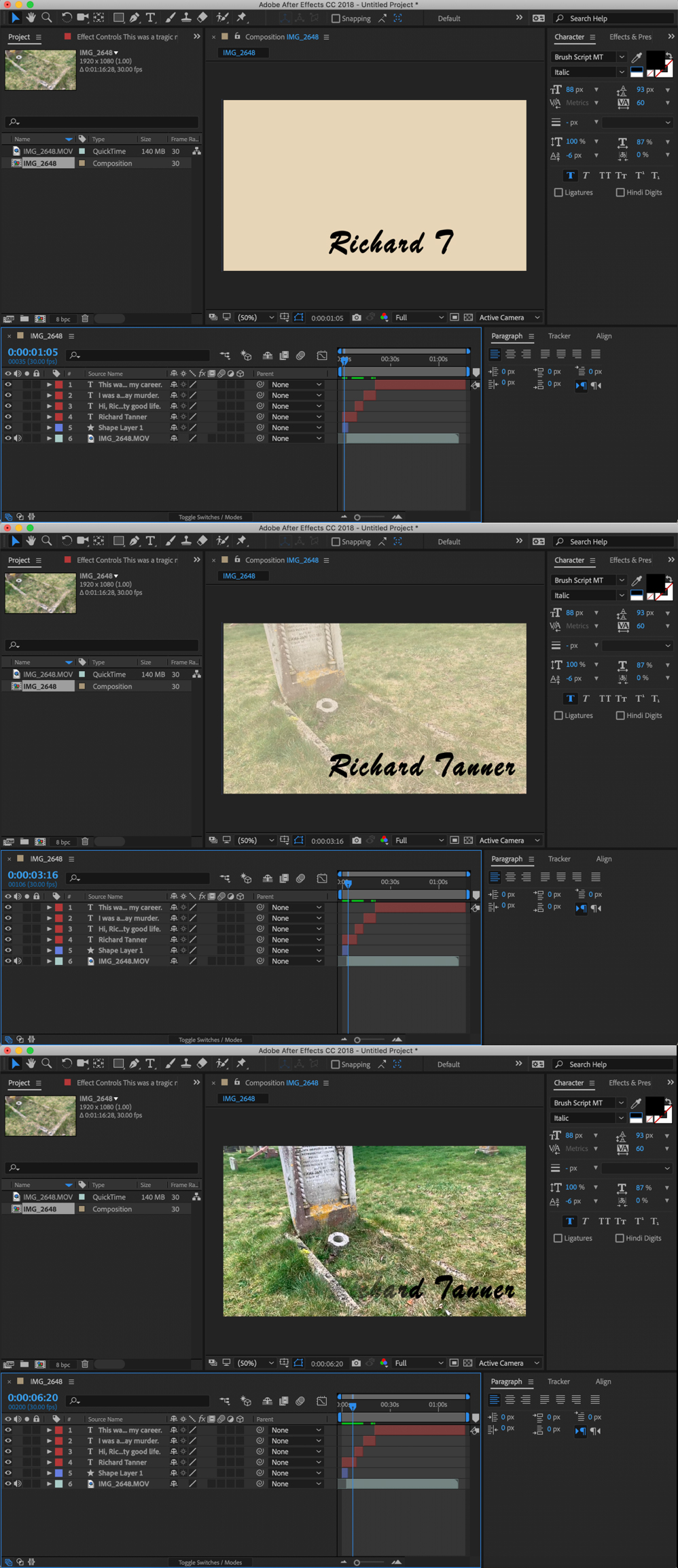
The Title
I decided on a beige background to again match the them of the main map. I then decided on the Brush Script font as it was thicker and bolder then SignPainter. The title originally faded out slowly before the video started but the title continuing to the video makes the transition a lot smoother. I use the type-writer effect to introduce all the video text. This was the best effect for a good transition from paragraph to paragraph.
The Text
I firstly played around with the text as I felt it wasn’t very clear. I firstly tried black, white with the Brush Script font but this still wasn’t clear, especially when the main audience will be the elderly.
I then changed the font to Charter (a much clearer font). This still wasn’t clear enough.
I then put the text inside a box of the same colour as the title page. This worked well I feel as its clear and doesn’t look too clumpy on the video- blends in well.
I fade the box in and out accordingly with the text. I don’t put the box in full opacity and only up to 80% so the background is still slightly seen.
Final videos are displayed in the final outcome section.
Website Designs
As a group we all contributed with the original website designs. We went for Tom's designs which is at the bottom of this page but below are some of my designs. As this was not my main role in the group, I did not go into as much depth as I did for the interactive map.
Below is my front page developments from last semester.
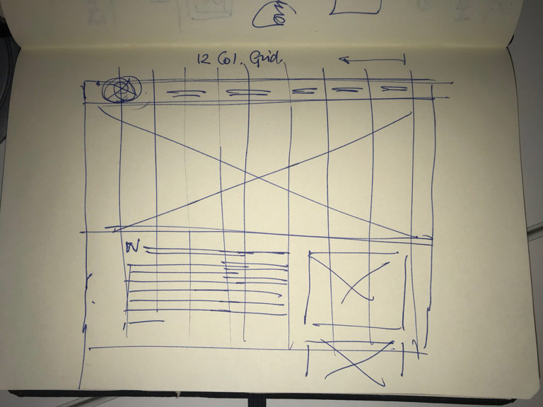
Our lecturer gave us feedback on the website and said we need to follow more of a grid format so it looks more structured. He also suggested trying out patterns to make the website come to life more and to add texture.
I experimented with different shades of colours, used hand-written text drawn with the paint feature on photoshop, and did the same for the icons. I used photoshop to draw these icons, text etc out because the paintbrush leaves it looking quite smooth around the edges etc. I used Adobe Illustrator for the main path line and background of the map.
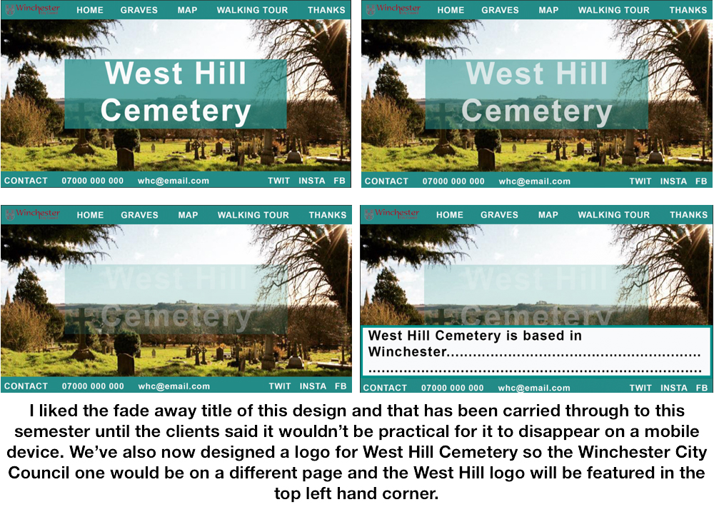
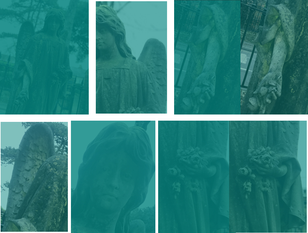
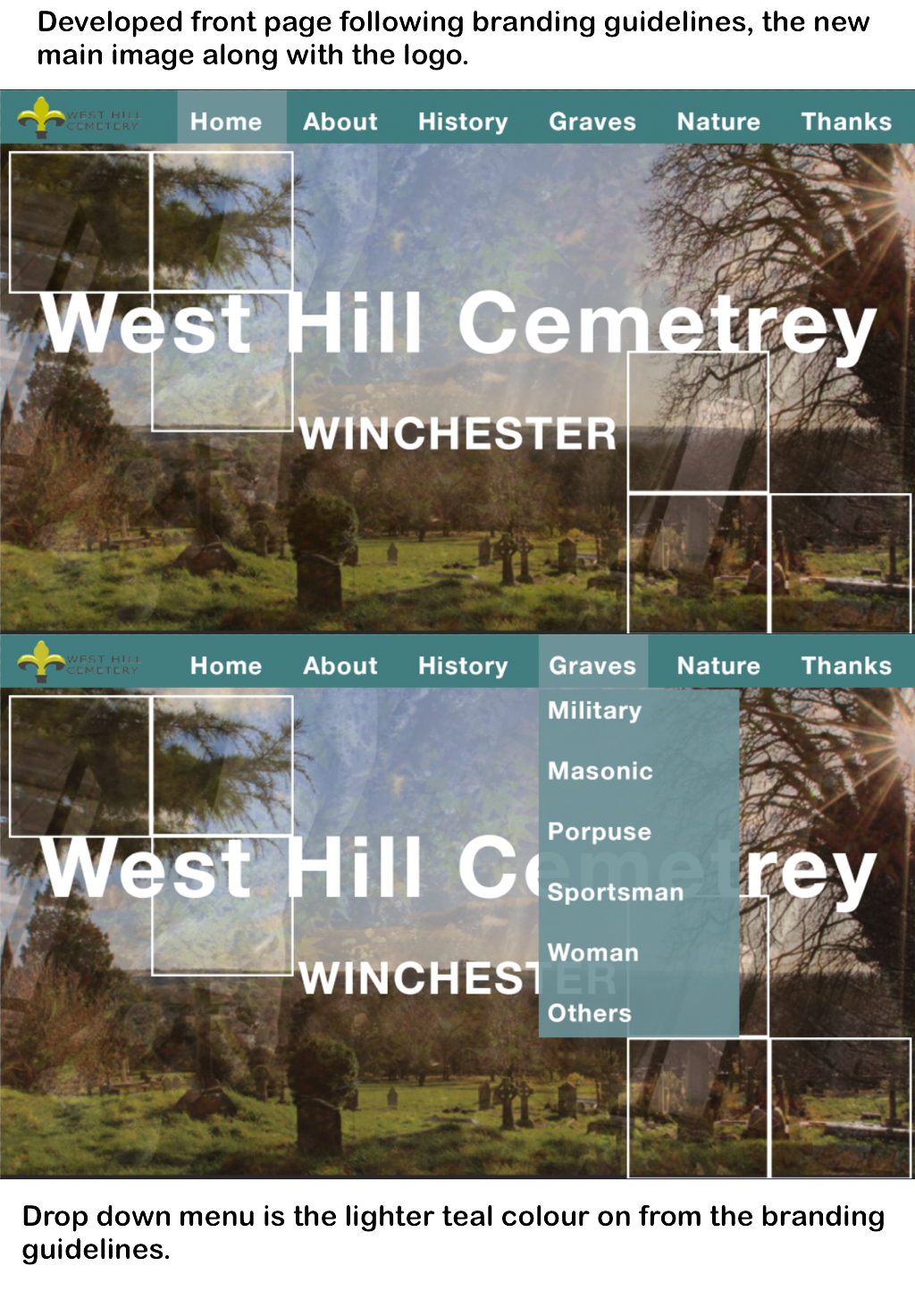
The designs below are for the background of the website pages. I used the angel as it’s one of the most popular graves in the cemetery and thought it would be a nice idea to have different elements of the angel in the background of all the different pages on the website. We still need to follow branding guidelines so I used a teal overlay onto of the angel images to create a nice effect. I trialed with different intensities of the teal colour to see which we preferred. I think the more teal option is better due to a lot of information being displayed on the page and don’t want to take the attention away from that.
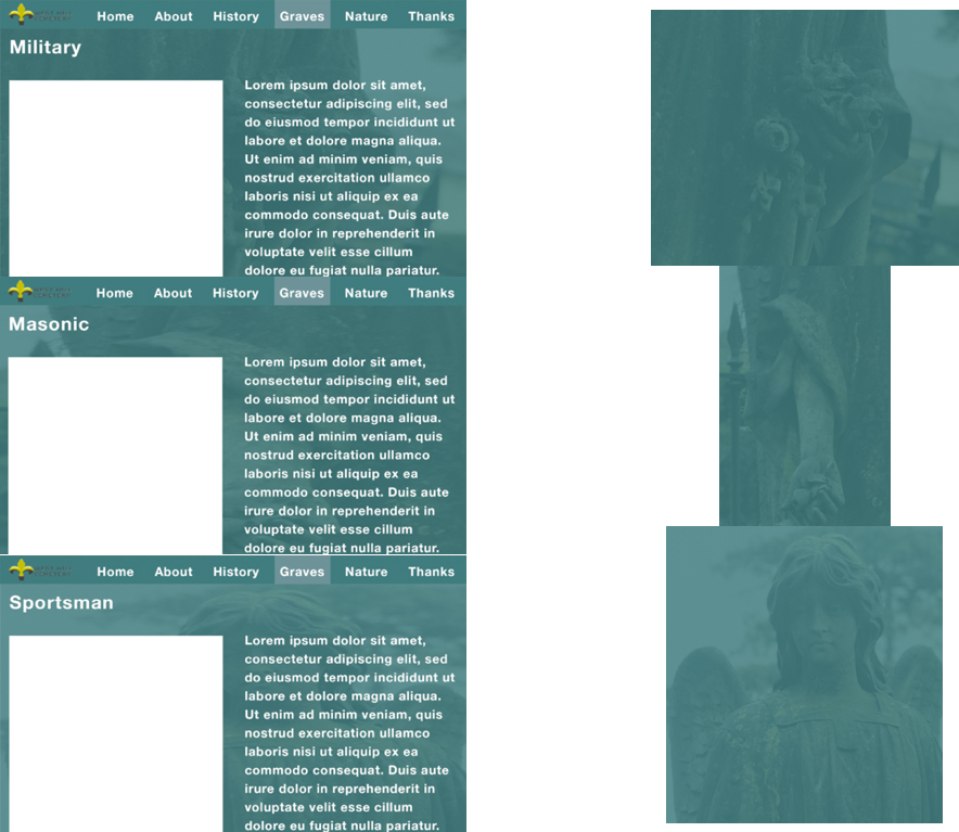
I then put the teal angel backgrounds I createdon on the backgrounds of some template pages.
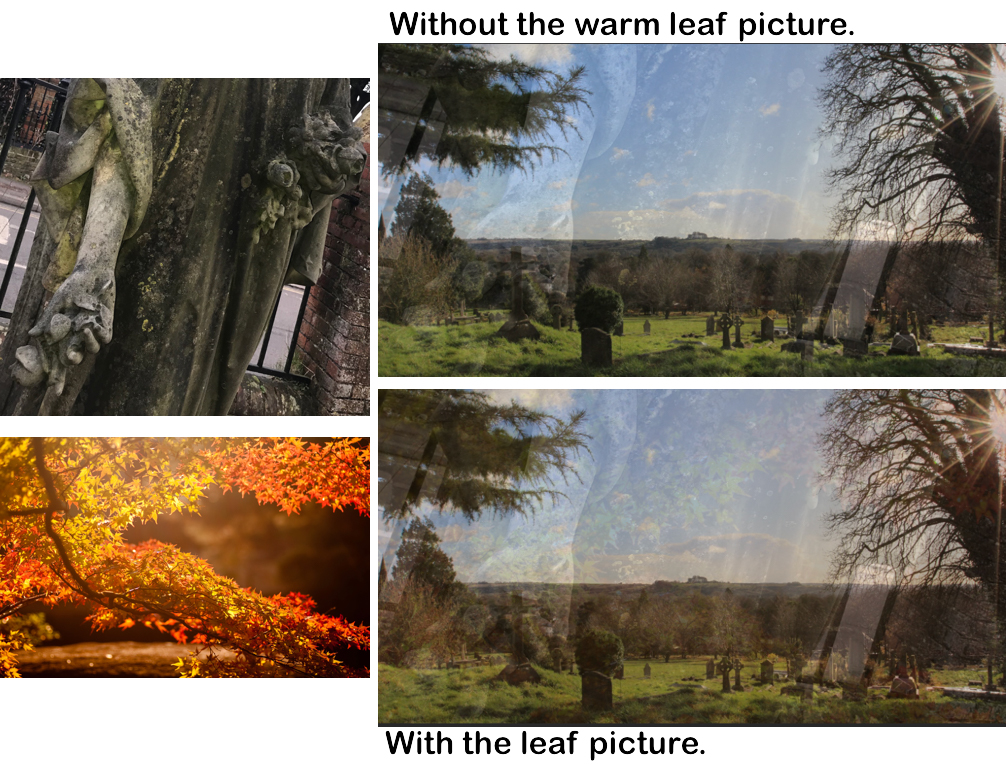
I trialed different patterns and textures to use for the main West Hill cemetery website front page image. This gives the image more of an effect and theme.
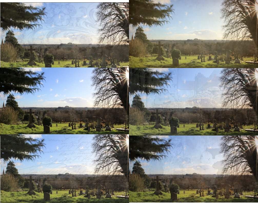
I then used a part of the angel along with a warm picture I found on google to create a warmth effect along with the angel image.
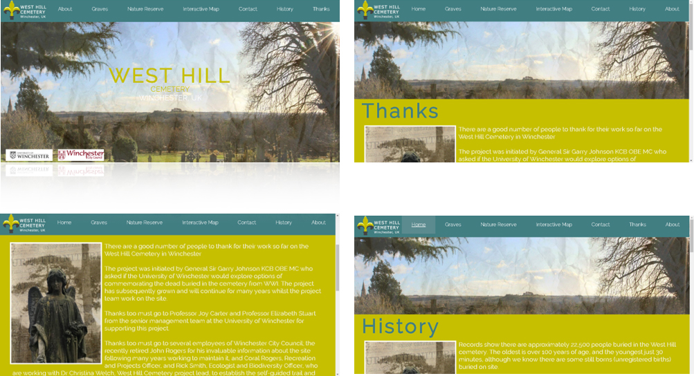
Below is Tom's website design we continued with.
Branding
It’s important, mainly for the website designs to follow the University Branding Guidelines due to copyright, and fear of the website getting shut down because of it. The Branding Guidelines can be found at the bottom of this page. Branding also gives the cemetery an identity that people will hopefully notice.
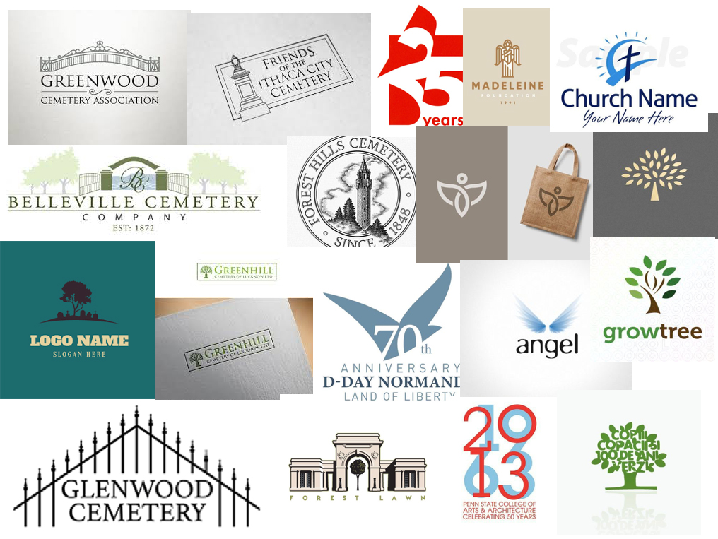
I firstly found various designs I liked the look of for inspiration.
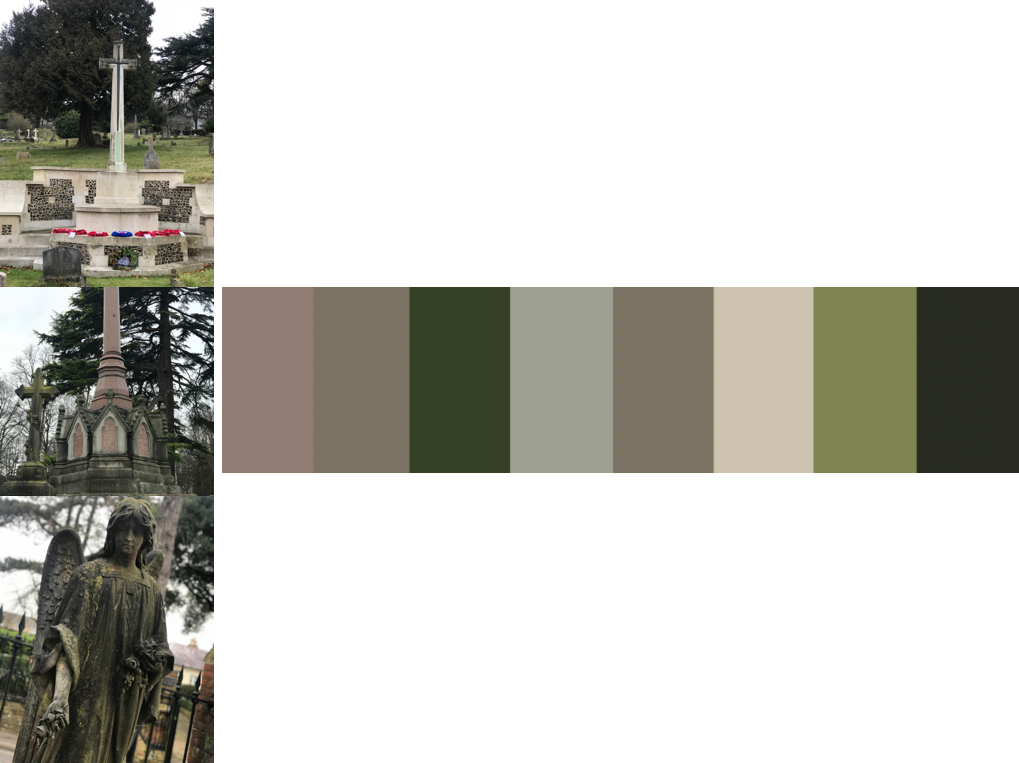
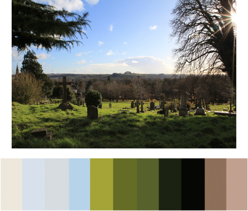
I then looked into a colour theme to follow for the cemetery based on its colours from images I took.
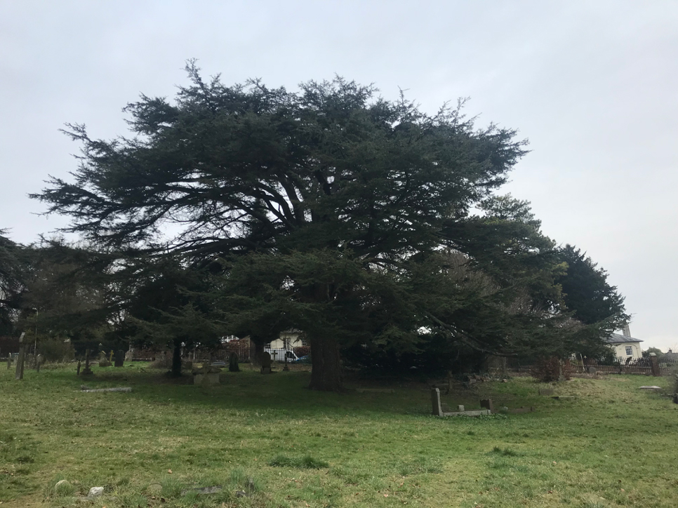
While walking in the cemetery, I came across the Cypress tree below which is a great asset to the grounds.
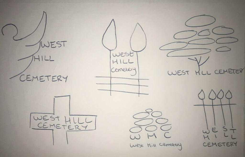
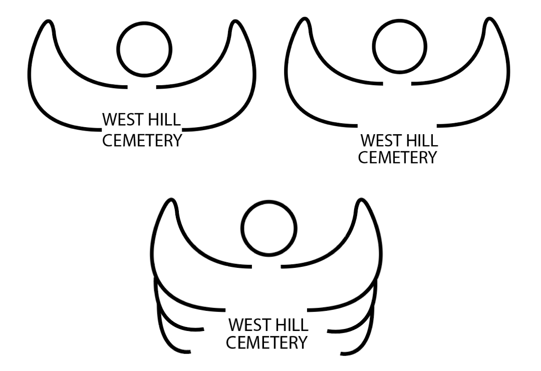
I firstly sketched some ideas for the logo.
I then developed the ideas digitally.
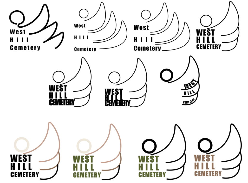
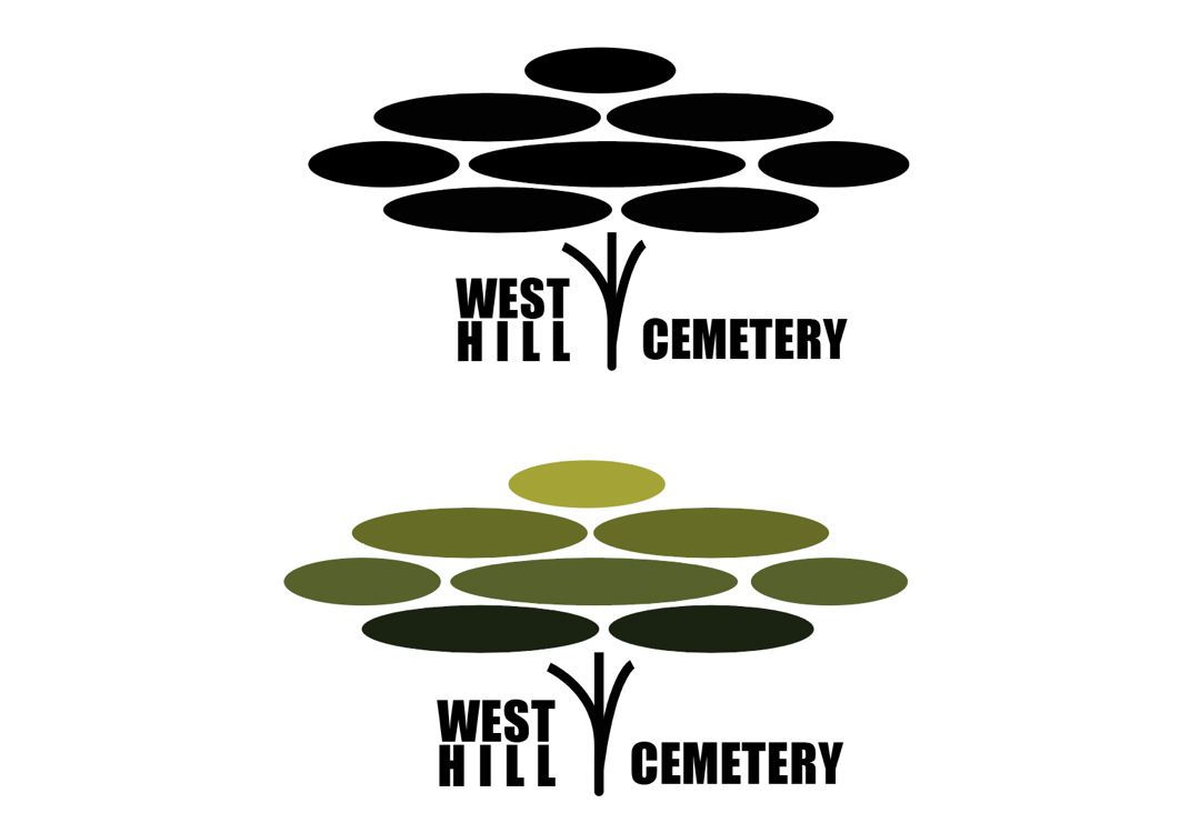
As a group we decided to continue with Tom's logo design, shown below.
Final Outcome
The final outcome was successful due to taking on a developer (Marti) to finish the coding for the website and handing it to the client, who were extremely satisfied.
Below is a video of the app in use.
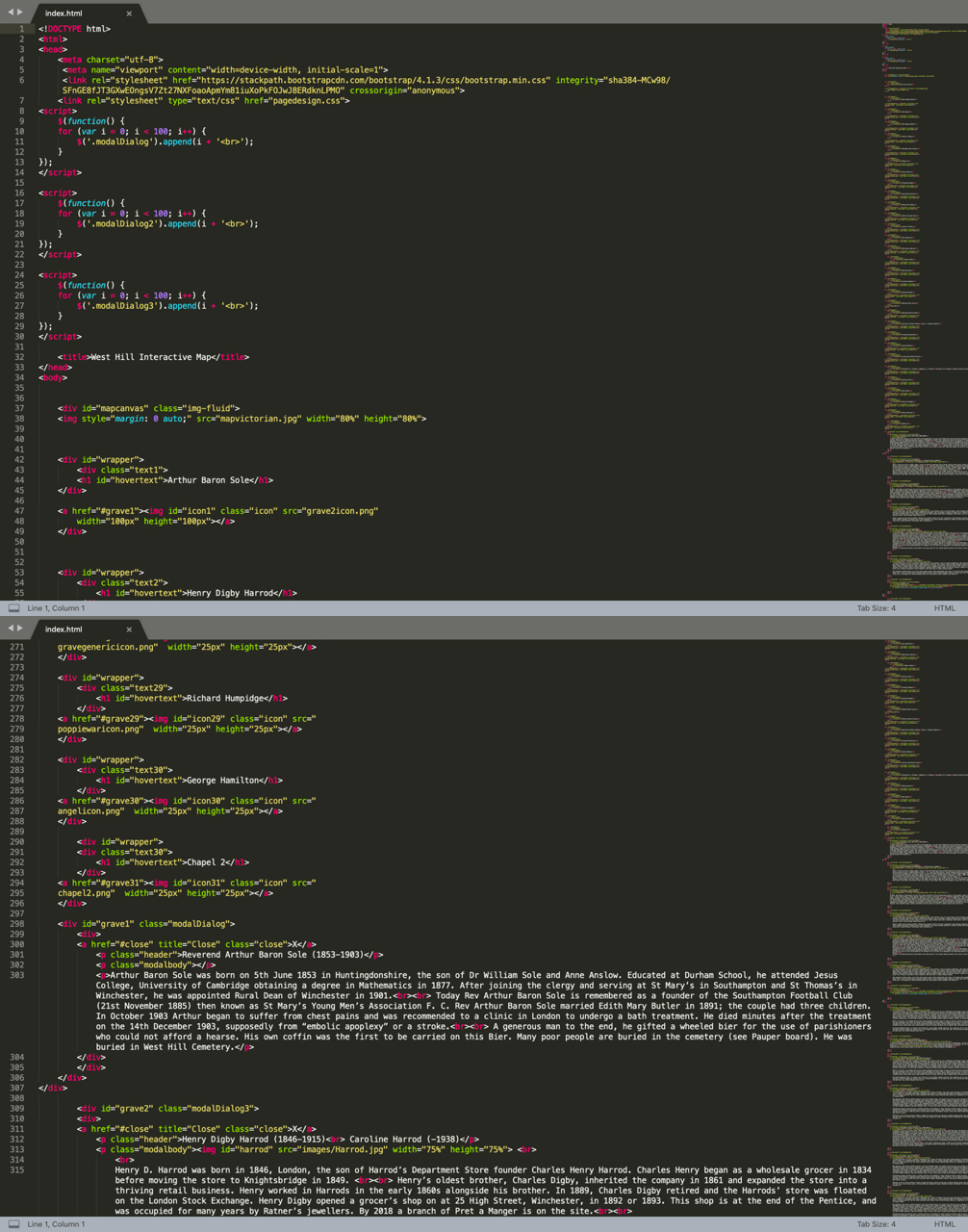
Being a designer I was super proud of myself for attempting code. The code is shown below.
I used various software I knew already and have learned from my last 3 years at University. It is important in third year to build on the skills we already know rather than trying to teach ourselves something new. This makes us more advanced in our specific areas of design.
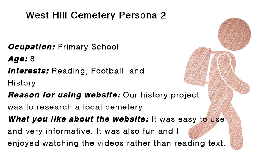
The target market for West Hill Cemetery is more the elderly generation due to family members of the graves being older, and this generation is more likely to want to learn about the cemetery. West Hill could also attract younger people from an educational point of view.

The West Hill Cemetery website should follow the University of Winchester branding guidelines as shown below. We also adapted them slightly to fit in with the new designs.